react tippy
Created: 2018-06-26 13:25:37 -0700 Modified: 2018-06-26 13:45:20 -0700
react-tippy is a library for producing tooltips. It is based on tippy.js and popper.js. As of 6/26/2018, tippy.js is included directly in the repo rather than being pointed at; you can find the code for tippy.js here.
Why I chose react-tippy over react-tooltip
Section titled “Why I chose react-tippy over react-tooltip”For a while, I was using react-tooltip, but then I ran into a problem where I couldn’t position the arrow coming off of the tooltip in the right location. This has been an issue since 2015. I’m nearly positive that at one point, I thought I would just code it for myself, but after 30 minutes or so, I gave up because of how involved of a change it would be.
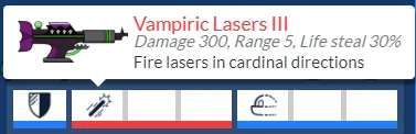
To be clear, this is the arrow that I was talking about; I wanted it to always point at the first slot in a weapon in Bot Land.
Using react-tippy with “position: absolute” elements
Section titled “Using react-tippy with “position: absolute” elements”The problem that I ran into was roughly this repro: https://codesandbox.io/s/jv16m3v1y9
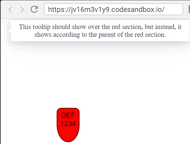
(assuming the codesandbox link won’t load, I’ll explain what’s happening here: the red section is absolutely positioned and I tried to attach a tooltip to it, but it’s showing in a random spot)
I found some similar issues on Popper’s GitHub:
However, I didn’t find any solutions through there. I thrashed against this for a while before finally figuring out that I could provide my own computeStyle to Popper through react-tippy (more notes to follow beneath the code):
import {  getBoundingClientRect,  getSupportedPropertyName,  getOffsetParent} from "popper.js/dist/popper-utils";
import "react-tippy/dist/tippy.css";
class RatingFlag extends Component {  renderTooltip() {    return <div>Tooltip goes here</div>;  }
  /**   * This is a function used by popper.js. The reason I overrode their   * function is so that I could position the tooltips on an absolutely   * positioned parent element. Without this, the tooltips show up in   * seemingly random spots on the screen.   * @param {Object} data   * @param {Object} options   * @return {Object}   */  computeStyle(data, options) {    const { x, y } = options;    const { popper } = data.offsets;
    const offsetParent = getOffsetParent(data.instance.popper);    const ratingFlag = data.instance.reference.children[0];    const ratingFlagRect = getBoundingClientRect(ratingFlag);
    // Styles    const styles = {      position: popper.position    };
    const sideA = x === "bottom" ? "top" : "bottom";    const sideB = y === "right" ? "left" : "right";
    // Avoid blurry text by using full pixel integers.    // For pixel-perfect positioning, top/bottom prefers rounded    // values, while left/right prefers floored values.    const top = Math.round(      _.clamp(        ratingFlagRect.top - popper.height / 2,        0,        offsetParent.clientHeight - popper.height      )    );
    let left;    if (sideB === "left") {      left = ratingFlagRect.left + ratingFlagRect.width;    } else {      left = ratingFlagRect.left - popper.width;    }
    left = Math.floor(left);
    const prefixedProperty = getSupportedPropertyName("transform");    styles[prefixedProperty] = `translate3d(${left}px, ${top}px, 0)`;    styles[sideA] = 0;    styles["left"] = 0;    styles.willChange = "transform";
    // Attributes    const attributes = {      "x-placement": this.props.flagFacesRight ? "left" : "right"    };
    // Update `data` attributes, styles and arrowStyles    data.attributes = { ...attributes, ...data.attributes };    data.styles = { ...styles, ...data.styles };    data.arrowStyles = { ...data.offsets.arrow, ...data.arrowStyles };
    data.arrowStyles.top =      ratingFlagRect.top - data.instance.popper.getBoundingClientRect().top;
    return data;  }
  render() {    const tooltipDirection = this.props.shouldTooltipBeOnTheLeft      ? "left"      : "right";
    const popperOptions = {      modifiers: {        computeStyle: {          enabled: true,          y: tooltipDirection,          fn: this.computeStyle.bind(this)        }      }    };
    return (      <Tooltip        arrow={true}        arrowSize={"big"}        html={this.renderTooltip()}        theme="light"        position={tooltipDirection}        useContext={true}        popperOptions={popperOptions}      >        <div>Hover here for a tooltip</div>      </Tooltip>    );  }}
What this is doing is it’s specifying custom behavior for positioning both the tooltip and its arrow. I only made it work for having the arrow on the left or the right. Also, the preventOverflow modifier doesn’t seem to work when using this, and I’m not totally sure why. I think it’s due to how it’s using data.instance.popper and data.instance.reference internally. To regain this behavior, I wrote in my own “clamp” logic that you can see in the code above for the “top” property. The same thing would need to be done for left/right, but I didn’t have that requirement out of my component.
One other problem is that the tooltip’s arrow is positioned incorrectly if the tooltips are set to always open. I’m nearly positive that this is due to animations, more specifically data.instance.popper.getBoundingClientRect().top will be the incorrect value at mount time, but then resizing the page by a single pixel will fix the property.