Mobile development
Created: 2017-10-12 17:53:56 -0700 Modified: 2019-06-18 14:00:20 -0700
Random resources
Section titled “Random resources”- Screen size information for tons of devices: http://screensiz.es/phone
- Another similar site: http://viewportsizes.com/
- iOS / device usage stats: https://david-smith.org/iosversionstats/
- Access to ~240 minutes per month of real device testing: https://appcenter.ms/#pricing
- When there are changes to the Apple Developer Program License Agreement, you can read the summaries here: http://www.appstorereviewguidelineshistory.com/
- You can run native mobile apps from your browser for 100 minutes per month via appetize
- Device frames for use in promotional photos/videos: https://facebook.design/devices (more here too; compatible with Figma on Windows).
- For producing screenshots for the various app stores, use a site like this: https://theapplaunchpad.com/#
Required image formats are here
6.5” iPhone
2688x1242 (landscape)
5.5” iPhone
2208x1242 (landscape)
12.9” iPad
2048x2732 (portrait)
2732x2048 (landscape)
10.5” iPad (optional if you provide 12.9” images)
1668x2224 (portrait)
2224x1668 (landscape)
Capturing these screenshots is easiest with Chrome’s DevTools → Responsive → choose the resolution of each image, but divide each dimension by two, then set the DPR to 2. That way, you end up with screenshots of the correct size and it doesn’t look like everything is zoomed out.
I set my mobile breakpoints to 1345 to accommodate this so that the phones still look like phone UIs.
This gives us resolutions of
5.5: 1104x621
6.5: 1344x621
12.9: 1366x1024
10.5: 1112x834 I didn’t even use these since it’ll take them from the 12.9” one.
Media queries
Section titled “Media queries”Overall notes
Section titled “Overall notes”Building up in sizes (e.g. small—>larger) with CSS rather than scaling down (large—>smaller)
Section titled “Building up in sizes (e.g. small—>larger) with CSS rather than scaling down (large—>smaller)”It seems to be the case that most people advise building for your smallest UI and then working your way up. There are a few reasons for this:
- Consistency with how others do things.
- Smaller UIs, while maybe not ideal, would still at least work on a larger screen, whereas the other way around may not even be functional.
- Smaller UIs typically imply that you’re on a less powerful device, so you want to cut out unnecessary operations like CSS styling that isn’t going to matter. Note that this doesn’t necessarily just mean media-query-related CSS since you could be overriding default CSS with a media query.
Choosing breakpoints
Section titled “Choosing breakpoints”“Should I set breakpoints based on the content that I have? For example, my login logo image allows the page to be about 720x640. Does that mean I should make a breakpoint just for that page for those dimensions?”
10:09 Karai17: 3) since your content is going to be viewed on devices, i think focusing on those devices is better than “content” break points
“How many breakpoints should I have?”
This is probably a good set:
/* Responsive Sizes (portrait mode) */$xs: 320px; /* iPhone 5 */$sm: 360px; /* 720p Phone */$md: 768px; /* iPad */$lg: 1024px; /* iPad Pro */$xl: 1200px; /* Desktop */
/* Responsive Sizes (landscape mode) */$xs: 568px; /* iPhone 5 */$sm: 640px; /* 720p Phone */$md: 1024px; /* iPad */$lg: 1366px; /* iPad Pro */$xl: 1920px; /* Desktop */
“What do I get from multiple breakpoints? Doesn’t this mean I’d need a UI mocked up at each of those breakpoints?”
Generally, yes, if there are going to be large structural changes, e.g.:
- On tiny screens, there’s a scroll list
- On medium screens, all of the items are shown in a grid
- On even bigger screens, we can show more details per item
That would be three mock-ups for three breakpoints, but maybe it’s really just for a single component rather than the entire structure of the page.
“If I have 5 breakpoints set, doesn’t that mean the UI should be switching at those breakpoints? Otherwise, what’s the point of having those breakpoints?”
10:19 Karai17: if you don’t want a switch, don’t break. you’re correct. usually though even if the ui doesn’t change, unless you’re using svg graphics you’ll want higher resolution ui images for an ipad over an iphone
10:20 texastomm: @Adam13531 The entire UI doesn’t have to change if it’s mobile responsive. E.g. I might have to divs floating next to each other that take up 50% each. On iphone’s in portrait, that might not make sense so we disble the float. However, the content inside of those divs will probably still be good to go.
Capabilities vs. devices
Section titled “Capabilities vs. devices”Based on this article:
“Devices should be judged by their capabilities since, in the end, it is those capabilities that define them.”
That means you shouldn’t just use size-based media queries as a stand-in for testing for capabilities. Just use them when you truly want something size-based.
You can do something like this to test for the most prominent interaction capabilities:
@media (hover: hover) { … }
@media (pointer: fine) { … }
On devices that are both touch and have a mouse or a stylus, like the Microsoft Surface, the hover and pointer media query will evaluate the primary input mechanism only. For those, you can get the union of all capabilities by looking at “any-pointer”, meaning SOME pointer attached to the device, even if it’s secondary, can use this capability
@media (any-pointer: fine) { … }
@media (any-hover: hover) { … }
8:49 freaktechnik: (oh, btw. you’ll want -moz-touch-enabled: 1 for Firefox compat)
8:50 freaktechnik: well, pointer is standard, but only chrome implements it
8:51 freaktechnik: so you need to use some non-standard stuff to make it work in every browser.
8:51 HiDeoo: Media query for pointer is Edge, chrome, safari, etc.
8:51 HiDeoo: Basically everyone except Firefox
https://caniuse.com/#feat=css-media-interaction
Resolution breakpoints
Section titled “Resolution breakpoints”There are many resources about this:
- Blog post about the most used responsive breakpoints of 2017
- Popular min-widths:
/_ Responsive Sizes _/
$xs: 320px; /_ iPhone 5 _/
$sm: 360px; /_ 720p Phone _/
$md: 768px; /_ iPad _/
$lg: 1024px; /_ iPad Pro _/
$xl: 1200px; /_ Desktop _/
React-media (reference)
Section titled “React-media (reference)”If you’re using React and media queries, check out this note that I wrote.
LESS CSS
Section titled “LESS CSS”For notes on using media queries in LESS CSS, go look at my LESS note.
Chrome + media queries
Section titled “Chrome + media queries”If you toggle device mode (ctrl+shift+M):
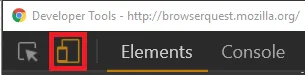
Then click the hamburger menu at the upper right of the device-view page:
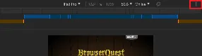
You’ll get a menu option for “Show media queries” to get a visual representation of all of this.
Changing an image based on a media query
Section titled “Changing an image based on a media query”CSS can’t modify HTML attributes, and an <img> tag’s “src” attribute is what controls the image that shows. Instead, you’ll have to use a “div” with the “background-image” CSS property.
Troubleshooting
Section titled “Troubleshooting”Can’t get pinch-to-zoom to work in Chrome
Section titled “Can’t get pinch-to-zoom to work in Chrome”When I ran into this for Bot Land, it’s because I had this meta tag in my HTML:
meta(name="viewport", content="initial-scale=1, maximum-scale=1, user-scalable=no, width=device-width")(note: that is a Pug template, so the syntax is a bit different)
The important part is the user-scalable=no