CSS grid
Created: 2018-05-14 10:14:22 -0700 Modified: 2018-08-28 09:37:01 -0700
Grid border (AKA coloring the gaps)
Section titled “Grid border (AKA coloring the gaps)”I made a quick JSFiddle here to represent the picture below:
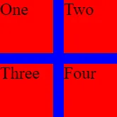
This was accomplished by giving the grid itself a blue background and giving each grid item a red background. However, if you put align-items:center on the grid, you end up with this:
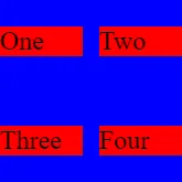
To fix this, I changed the “item” class to look like this
.item { align-self: stretch; background-color: red; display: flex; flex-direction: column; justify-content: center;}
Using a grid as a table (not sure how to word this better)
Section titled “Using a grid as a table (not sure how to word this better)”To be clear, I’m referring to something like this picture:
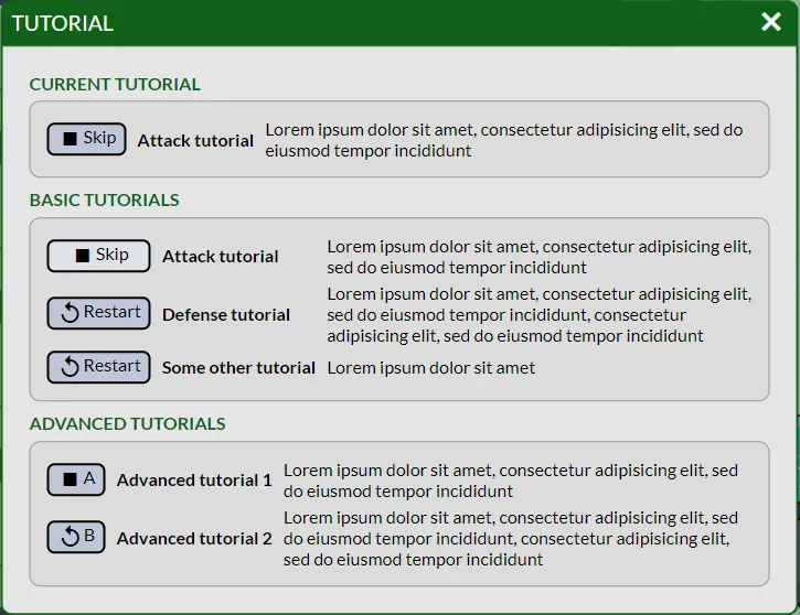
Shown above: each “row” of the dialog is a TutorialDialogEntry, and it’s responsible for rendering a button/name/description for each tutorial. The rows render into a section that is a grid. I wanted each grid column in the section to have the same width. If you were to type all of this out manually in JSX in one component, it would look something like this:
<Grid> <Button/> ← (row 1) <Name/> <Description/> <Button/> ← (row 2) <Name/> <Description/></Grid>However, because TutorialDialogEntry is controlling the button/name/description combo, the JSX looks like this:
<Grid> <TutorialDialogEntry/> <TutorialDialogEntry/></Grid>This means that TutorialDialogEntry has to render a Fragment so that we end up with the JSX from earlier. Without that, the grid will try laying out its immediate children according to the row/column setup.
Notes:
- I don’t know how many rows are going to be in this UI. That’s okay, I just specify “grid-template-columns: auto auto 1fr;” for each grid and let it figure the number of rows out.
- If I wanted each grid to have the same widths/heights, I would probably need to set a static width and height. Alternatively, a table can be used.
Having multiple columns be the same size
Section titled “Having multiple columns be the same size”Originally, I did something like this:
grid-template-columns: 33.3% 33.3% 33.3%;However, that’s bad because if “33.3%” causes the browser to round down, then you can end up with an extra pixel on the side of the grid. It’s better to write it like this:
grid-template-columns: 1fr 1fr 1fr;One note is that you can use “repeat” for this:
grid-template-columns: repeat(3, 1fr);Gotchas (or at least good things to know)
Section titled “Gotchas (or at least good things to know)”Spanning rows/columns
Section titled “Spanning rows/columns”The syntax is something like this:
grid-column: 3 / span 2;
grid-row: 3;
This says to position the cell described above in columns 3 and 4 in row 3. Span is a width, not an ending coordinate.
How to get flex-like behavior for a row or column without actually using a <flex>
Section titled “How to get flex-like behavior for a row or column without actually using a <flex>”I’m documenting a particular problem that I had while making Bot Land. I had a 2-column, 3-row grid as shown below:

I wanted the “X” to take up as little space as possible without affecting the “Reward” cell. The way I thought was to make a <flex> for the last row that spanned both columns, but that makes it much harder to use just CSS to change how the grid is laid out.
A better solution was to add another column entirely:

I made the reward’s column span be 2 (“grid-column: 2 / span 2”) and put the “X” in the final cell in the grid.
Another way this could be done is by “drawing” out the grid in CSS with grid-template-areas (reference). FYI: grid-template-areas doesn’t let you do anything that you can’t do with grid-column and grid-row.
Troubleshooting
Section titled “Troubleshooting”Grids aren’t being sized correctly
Section titled “Grids aren’t being sized correctly”I ran into an issue on Chrome (official bug report here) where it reported that a grid had a height of 900 px, but without an explicit height: 900px property on it, it didn’t size the grid items based on that height. This image sums it up: https://imgur.com/a/DHyps
It seems like the bug report that I linked above describes the issue better; it is a result of the grid getting its height from a flexbox. The workaround is to add “flex-basis: 0” to the grid element (or potentially immediate ancestors of the grid as well).
It worked fine in Firefox, so it’s a good idea to test this in multiple browsers to see if you’ve got something working anywhere first.