react color
Created: 2018-05-14 11:49:09 -0700 Modified: 2018-05-14 11:59:50 -0700
This is a color swatch library.
Add a label inside of an existing picker
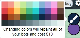
Section titled “Add a label inside of an existing picker”I did this for Bot Land where I added a label into a GithubPicker:
This was not so straightforward because react-color does styling inline, so there’s no way to override it with CSS classes. This left me with a few options:
- Create my own custom component with their library that was largely like the picker that I wanted. I felt like I would be reusing most of the original picker’s code if I did this.
- Override inline styling with this trick where you use !important. The problem here is that I’d have to use “!important” which I like to avoid.
- Fork their library and make GithubPickerWithLabel. The problem here is that then I have to maintain another repo and make sure to pull in changes from master every once in a while (and probably merge in changes from GithubPicker).
- Inject a div directly into the color picker using ReactDOM.
- Override their inline style by getting a ref to their div.
I ended up overriding their inline styles by getting a ref to the div and just changing them directly:
class ColorPickerPopup extends Component {  componentDidMount() {    const domNode = ReactDOM.findDOMNode(this.githubPickerRef);
    domNode.style.border = "none";    domNode.style.boxShadow = "none";    domNode.style.padding = 0;  }
  catchClicks(event) {    event.stopPropagation();  }
  render() {    return (      <div onClick={this.catchClicks.bind(this)}>        <GithubPicker          triangle="hide"          ref={node => {            this.githubPickerRef = node;          }}        />        <div>Extra text here</div>        <div className={styles.colorPickerPopupTriangle} />      </div>    );  }}
Then, I had a CSS class in the parent div of GithubPicker that put the styles I wanted back in.
Allow different number or sizes of swatches dynamically
Section titled “Allow different number or sizes of swatches dynamically”Again, because react-color uses inline styling for everything, I hacked this together where I overrode the swatch styling individually:
class ColorPickerPopup extends Component {  componentDidMount() {    const domNode = ReactDOM.findDOMNode(this.githubPickerRef);
    const sizeOfEachSwatch =      parseInt(this.props.totalWidth, 10) / this.props.numberOfSwatchesPerRow;
    _.forEach(domNode.children, child => {      if (child.nodeName.toLowerCase() === "span") {        const grandchild = child.children[0];        grandchild.style.width = `${sizeOfEachSwatch}px`;        grandchild.style.height = `${sizeOfEachSwatch}px`;      }    });  }
  render() {    return (      <GithubPicker        ref={node => {          this.githubPickerRef = node;        }}      />    );  }}