CSS
Created: 2015-03-17 23:36:49 -0700 Modified: 2022-06-09 16:55:39 -0700
General notes
Section titled “General notes”- Minimalist CSS libraries to make your site look nice while prototyping:
Transition animations
Section titled “Transition animations”(note: I’m referring to triggering events in JavaScript when an animation is done in CSS)
I used a special React library for this which I described in this note.
Mobile learnings
Section titled “Mobile learnings”This section contains things that I learned while converting Bot Land to mobile that may be helpful in the future.
When possible, make it so that only CSS differs between mobile and desktop
Section titled “When possible, make it so that only CSS differs between mobile and desktop”I think this is the biggest take-away that I’ve had so far. If you have two wildly different HTML structures, then you’re going to have to maintain different HTML and different CSS, so ideally you would only have to change CSS so that you could cut down on maintenance.
How to go about doing this isn’t always obvious. Here are some general tips:
- “High-level” layouts like Grid and Flexbox can be helpful since you can change the order of children within CSS. Note: some browsers don’t have support for these still, in which case you’d need fall-back CSS.
- There are cases where your HTML only seems to differ, but it ends up being safe to use the same HTML. For example, I ran into a specific problem where on desktop, I wanted a set of buttons to be in a flexbox so that they could be grouped in the same part of the UI, and on mobile, I wanted those buttons to be spewed across the page with “position: absolute”. I knew that the desktop HTML would need a <div> (with “display: flex”), but I thought that the mobile HTML would want to remove that <div>. It turned out that removing them wasn’t necessary as long as the flexbox didn’t have a “position” property that would interfere with the absolute positions that I wanted.
Wrapping text with an ellipsis (AKA truncate/truncation) (reference)
Section titled “Wrapping text with an ellipsis (AKA truncate/truncation) (reference)”When you want something like this to happen like “ACCELERATION MISSILES” showing as it does below…
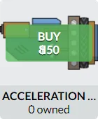
You need “text-overflow: ellipsis;“. However, that also means you can only have one line of text to have the ellipsis, and you need some additional properties for even that to work:
white-space: nowrap; width: 100%; overflow: hidden; text-overflow: ellipsis;(also, your element cannot have display: inline)
Here’s a solution I didn’t look into fully that talks about having an ellipsis for multi-line text: https://codepen.io/martinwolf/pen/qlFdp
There’s a resource specifically for FlexBox + ellipsis (reference).
Troubleshooting ellipsis stuff
Make sure the parent has the right width set. If it doesn’t, then set “width: 100%” on it or its ancestors. If it does, then you probably don’t have “overflow: hidden” on the right element.
Grid (see my other note here)
Section titled “Grid (see my other note here)”(see this link)
Making an arrow label/flag/tag
Section titled “Making an arrow label/flag/tag”You could do something like this:
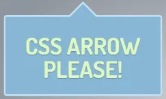
However, it’s WAY easier to use SVGs for any sort of arbitrary shapes than to use CSS. Look at this note for more information.
Making a ribbon with a “shadow” around it (reference)
Section titled “Making a ribbon with a “shadow” around it (reference)”
I modified the CSS to make it more obvious where the colors correspond to:

.ribbon{ font-size:20px; position:relative; display:inline-block; margin:5em; text-align:center;}.text{ display:inline-block; padding:0.5em 1em; min-width:20em; line-height:1.2em; background: red; position:relative;}.ribbon:after,.ribbon:before,.text:before,.text:after,.bold:before{ content:''; position:absolute; border-style:solid;}.ribbon:before{ top:0.3em; left:0.2em; width:100%; height:100%; border:none; background:black; z-index:-2;}.text:before{ bottom:100%; left:0; border-width: .5em .7em 0 0; border-color: transparent lime transparent transparent;}.text:after{ top:100%; right:0; border-width: .5em 2em 0 0; border-color: cyan transparent transparent transparent;}.ribbon:after, .bold:before{ top:0.5em;right:-2em; border-width: 1.1em 1em 1.1em 3em; border-color: magenta transparent magenta magenta; z-index:-1;}.bold:before{ border-color: orange transparent orange orange; top:0.7em; right:-2.3em;}HTML:
<p class="ribbon"> <span class="text"><strong class="bold">Example:</strong> StackOverflow ribbon</span></p>This is some CSS wizardry. You need the “bold” class for the orange “shadow” on the right side even though you don’t need text inside of a span with that class.
SpoonBytes made a ribbon for me for Bot Land
SpoonBytes: https://codepen.io/SpoonBytes/pen/ddxWOm
Having images maintain aspect ratio, be constrained by the smaller dimension (w vs. h), and fill as much space as possible without specifying dimensions
Section titled “Having images maintain aspect ratio, be constrained by the smaller dimension (w vs. h), and fill as much space as possible without specifying dimensions”This only seems to be possible when you know the size of the image’s parent. I.e. if you remove the <img> tag altogether, its parent would still be sized correctly (e.g. because it’s a flexbox or grid and it knows to take up the rest of the space in a given part of the page).
To be clear, here’s what all of the requirements are:
- Maintain aspect ratio: the image shouldn’t get distorted as it resizes
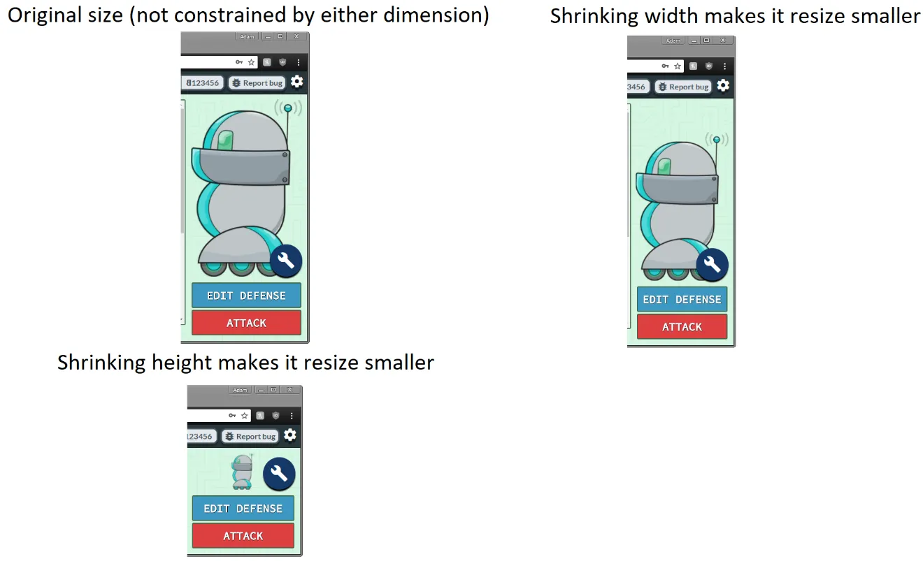
- Constrain the image by the smaller dimension:
- When height <= width, the image resizes
- When width < height, the image resizes
- To clarify the above, here’s a picture:
- Don’t specify dimensions: don’t want to have to know the image’s size ahead of time. Parent containers are typically flexible in that they resize to fill some space.
Here are explicitly NOT requirements:
- Support IE (pretty sure resizing images doesn’t work correctly in IE without using a <div> with background-image and background-size:contain)
To do this, put this on the <img> tag:
max-width: 100%;max-height: 100%;position: absolute;The position property is there since it’s the container that has the size, you don’t want the image’s size to affect the parent.
If you can’t use “position: absolute” because you want the positioning to be given by something like a grid with “justify-self”, then you should use a <div> with the background-image set:
background-image: whatever;background-size: contain;background-repeat: no-repeat;background-position: center;height: 100%;width: 100%;The reason this works is because the parent container gives it the size. This won’t work with an <img> tag with “position: absolute” because then something like “justify-self: center” won’t work while within a grid (since “position: absolute” needs to have a “left: 0px” somewhere, and that overrides justify-self).
Note that if you don’t know the size of the container and you want the image to expand to fill as much space as possible while maintaining its aspect ratio, it just doesn’t seem to be possible via HTML/CSS as of 2/23/2018. I tried putting a duplicate <img> with “visibility:hidden”, but then the height wouldn’t be constrained.
It may be possible using the technique described here.
If you do know the size of the container because it’s a flexbox, you may have to have a <div> with background-image and flex:auto rather than just an <img> tag itself.
<div> with background-image vs. <img> tags
Section titled “<div> with background-image vs. <img> tags”There’s not much you can do with a <div> with “background-image” that you can’t just do with an <img>.
Some differences:
- The section above in my notes about not being able to use “position: absolute” on an <img> tag but having the parent’s dimensions be known before filling it with content is a reason to use a <div>.
- IE support of resizing <img> tags is sucky.
- Apparently <div> can actually have multiple backgrounds according to this blog post
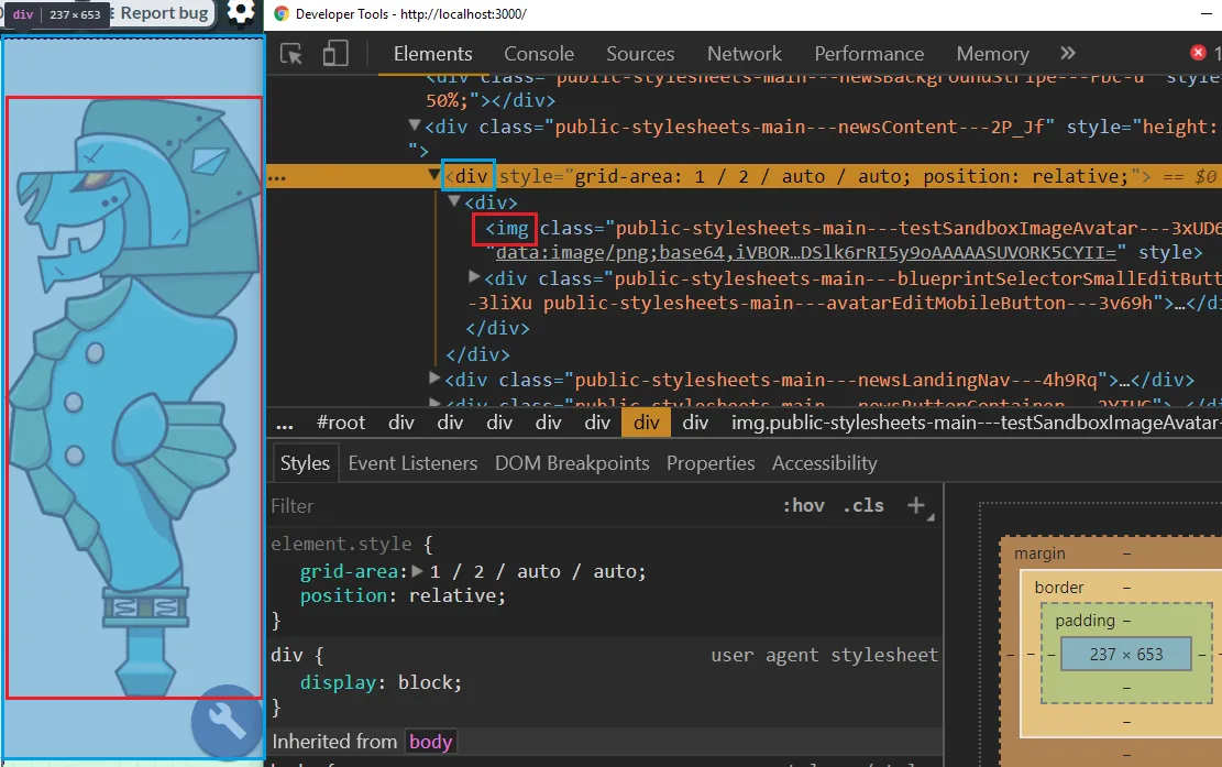
- Using an <img> is better if you want to position things relative to the “image’s” size rather than the “div’s” size. The following picture shows an <img> tag used with “src” instead of a <div> with background-image.
Here’s roughly the same thing but with a <div> with background-image set:
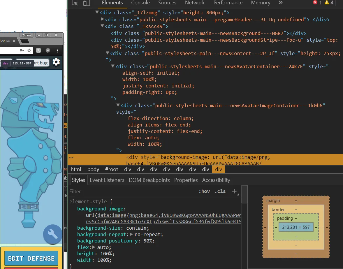
This is complicated when using transform:scaleX(-1) on the image though because then children with “left:0” will be on the right side, not the left.
- <div> inside of a flexbox lets you use “flex: auto” how you’d expect. With an image, you end up with the image’s original size.
- A div with flex:auto (but with no content since I didn’t feel like setting that up):
- An <img> with flex:auto (it’s gigantic because it’s the image’s original size):
- A div with flex:auto (but with no content since I didn’t feel like setting that up):
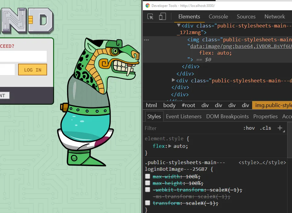
The only property I think you get from a div that you can’t get on an image is background-repeat, although I think it has such specific use cases that it doesn’t matter.
Also, “background-size: contain;” and “background-size: cover;” are sort of replaced by “object-fit”, but I don’t even have to use object-fit most of the time as long as I put “max-width” and “max-height” on an image.
So basically, to get an image that will resize without distorting the aspect ratio, use this CSS:
max-width: 100%; // or, instead of %, use pixel values or whatever max-height: 100%; width: auto; // possibly not needed since I think it's the default value height: auto; // see "width"Here’s an example page that Minkler linked: https://jsfiddle.net/fu6xhv00/19/
Troubleshooting <img> sizes
- If the image isn’t maintaining its aspect ratio
- First, try putting it in a div that gets sized to the space you want to fill.
- If the image fills that space correctly, then perhaps the parent div needs a different flex-direction, align-items, or justify-content.
Terminology (reference)
Section titled “Terminology (reference)”Ruleset: this is the combination of “everything” that you see here (the combination of selector, declaration, property, and value):
.foo {
color: blue;
}
Use multiple transforms at once
Section titled “Use multiple transforms at once”(just use a space)
transform: skewX(20deg) scaleX(2) translateX(50%);
Scaling fonts based on the size of their container
Section titled “Scaling fonts based on the size of their container”https://stackoverflow.com/questions/16056591/font-scaling-based-on-width-of-container
2:25 HiDeoo: Adam13531 You can also check the second answer for detailled about not scaling on the viewport but another container
I used react-fit-text, but I’m really not too happy with it.
transform: skewX(45deg)
Section titled “transform: skewX(45deg)”(note: formulas below work in Python (you may have to “import math”))
Suppose you have a “vertical” rectangle and you skew it. If you want to figure out how many pixels on the screen the skewed rectangle will take up, you can use this formula:
totalWidth = width + origHeight / math.tan(angleInDegrees * math.pi / 180)
Note: width is just the “width” property on the rectangle. origHeight is the container’s height (because if you were to rotate by 90°, your “vertical” rectangle would be infinitely wide), and angleInDegrees is the skew value.
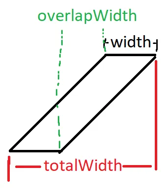
To compute overlapWidth, it’s just totalWidth - 2 * width. Technically I should have named this “gapWidth” or something because a positive number indicates that there’s a gap between the top and bottom of the skewed rectangle.
If you wanted to skew a box such that you had a certain overlap, then you need this formula
width = (origHeight / math.tan(angleInDegrees * math.pi / 180)) - overlapWidth
So if you want an overlap of 10 pixels, then you would actually need to add 10 to the end because that’s technically a gap of -10.
Slanted borders on divs
Section titled “Slanted borders on divs”To accomplish this, you need to use pseudo selectors (::before or ::after).
Reference (by Liquidor): https://jsfiddle.net/DennisRas/e2Lyemz8/
The general theory here is to do something like this (which shows how a slanted right border works):
<div class=‘first’>
Hello
</div>
<div class=‘second’>
world
</div>
div {
display: inline-block;
}
.first {
background-color: red;
position: relative;
z-index: 1;
}
.first::after {
background-color: red;
border: none;
content: ”;
height: 100%;
position: absolute;
top: 0px;
left: 100%;
transform: skewX(-20deg) translateX(-50%);
width: 30px;
z-index: -1;
}
.second {
background-color: blue;
padding-left: 20px;
}
Notes:
- Liquidor: @Adam13531 content is always nescesary for pseudo elements (::before, ::after) or they won’t show
- The padding-left on the second element is to keep consistent background colors where expected. Without this, the ::after element isn’t considered for sizing/location.
- Liquidor found a way in his fiddle to avoid a transform: translate (he used transform-origin)
content: ”;
display: block;
background: lightblue;
position: absolute;
width: 24px;
height: 100%;
top: 0;
right: 0;
transform: skew(-20deg);
transform-origin: left bottom;
- 3:45 HiDeoo: If you get that a lot in the UI, you should make a mixin like that https://codepen.io/o/pen/wosfH maybe
Child has different height from its parent (typically with canvas/video)
Section titled “Child has different height from its parent (typically with canvas/video)”I ran into a problem with this sort of HTML:
<div>
<canvas>
</div>
The canvas had a height of 860px, and the parent div always had a height of 864px. I didn’t know where the 4px was coming from. Turns out changing canvas from “inline” or “inline-block” to just “block” fixed it.
Patterns for a background
Section titled “Patterns for a background”This site generates SVGs and boils it down to two lines of CSS: http://www.heropatterns.com/
Positioning elements like this
Section titled “Positioning elements like this”![]()
Above we can see three general sections (“Store” / “Packs” / “Money”) and they have margin between them but not as much between the edges of the container. To accomplish this, we can just set a margin-right on everything except for the last element. In LESS, this would look something like this:
.spaceChildren { & > div { margin-right: 10px; &:last-child { margin-right: 0px; } }}Another way of doing this in LESS is to use mixins:
.noLastChildMarginRight() { &:last-child { margin-right: 0; }}.myClass { margin-right: 10px; .noLastChildMarginRight;}In CSS, it would look something like this
.replayLogOutcomeRow > div {    margin-right: 10px;}
.replayLogOutcomeRow > div :last-child {    margin-right: 0px;}
Remember: it’s generally a bad idea to ever use ’_’ in MySQL or CSS, so if you have multiple kinds of children, instead of doing “.foo > _”, try something like “.foo > div, .foo > span”. In LESS it would look like this:
.replayLogOutcomeRow { & > button, & > span { margin-right: 10px; &:last-child { margin-right: 0px; } }}Note: if you’re having a problem identifying certain elements, it can be helpful to put background-color properties on them.
Border / radius (reference)
Section titled “Border / radius (reference)”The reference link is just a tool for setting up border-radius. I don’t think it’s too helpful given how much Chrome can do with its dev tools here.
Sizing divs
Section titled “Sizing divs”12:09 sikmofo: if you want to use height 100% you need to do that all the way to a parent that has a set height that is not a percentage
If you don’t do this, you’ll run into bugs like this and this.
Sliding divs
Section titled “Sliding divs”In order for a transform to apply, the element you want to transform must be present in the DOM. This means that when I want to slide a div from out-of-screen onto the screen, I think the best way to do it is to have the element in the DOM and just not visible. Then, set an absolute position on them (and make sure the parent has a relative position) and just add a CSS class that has a transform: translate on it. For more detailed information, see my React notes here.
Centering elements
Section titled “Centering elements”10/11/2016
https://css-tricks.com/centering-css-complete-guide/
Troubleshooting
Section titled “Troubleshooting”- If you’re using Flexbox, are you sure you set “display: flex” on the element?
- Flexbox only affects its direct descendant. This isn’t always a problem if the grandchildren take up the full space of the child element (which will be affected (e.g. centered)).
To center an absolutely positioned div (reference), use
left: 0; right: 0; margin: 0px auto;
2/22/2017
LoChiamavanoBadur: This link adam http://howtocenterincss.com/ not a big deal tho, you might not need it
Triangular button
Section titled “Triangular button”6/13/2016
To accomplish simple triangles, you can use the following basic structure:
background: none;border-style: solid;border-width: 10px;border-color: @themeColor3 transparent transparent transparent;content: "";display: block;position: absolute;height: 0;width: 0;Then, just specify the right border-color to get either the top, left, right, or bottom triangle.
11:38 Gr4nnySith: @Adam13531 you could also use “color transparent transparent color” and then set the border widths as the total of however wide the bar is. Then you don’t need to change the positioning.
Triangular button in CSS (just filing these notes, they may not be great):
.playButtonOverlay
{
position: absolute;
right: 100px;
bottom: 100px;
width: 0;
height: 0;
border-bottom: 100px solid red;
border-left: 100px solid transparent;
}
I could rotate a button so that it looks like a triangle: https://jsfiddle.net/qbrhLtgL/
If I want text in that case, then I could put the text in a div and rotate it inside the button
Flexbox
Section titled “Flexbox”align-self: stretch (reference)
Section titled “align-self: stretch (reference)”I ran into a problem where this happened:

The controls in the center are being squashed because I have HTML like this:
<div style={{display: 'flex', flexDirection: 'row', alignItems: 'center'}}><somethingThatShouldShrinkVertically /><somethingThatShouldNotShrinkVertically /></div>I wanted the buttons to be aligned vertically (and shrink to their minimum heights), but I didn’t want the controls in the middle to do the same.
It turns out there’s a property for this: align-self: stretch. You can put this directly on the component that should not shrink vertically.
Note: make sure you don’t have “height: 100%” on the same element (which you shouldn’t have had in the first place)
Getting all children to be the same size
Section titled “Getting all children to be the same size”I wanted a layout like this (in equally sized columns, not rows; for rows, use a grid):
[Item 1] [Item 2] [Item 3]
I made a flexbox to contain the three items, but I wanted them all to have “width: 33%“. Turns out you use flex-basis for this: “flex-basis: 33%“. By using width, the elements could still resize and end up with one thinner than another.
Note: technically flex-basis should be 33.3333% in those cases, but it typically won’t matter because flex-basis is used to specify the initial size, and your content will probably have margins and stuff that makes it larger than 33% anyway (reference).
Let’s say you wanted to have only [Item 1] and then have blank space where items 2 and 3 were; you should just set “flex-basis: 33%; visibility: hidden;” where items 2 and 3 would have been (and make sure to make two separate divs for those), that way [Item 1] doesn’t expand to fill the space that would have been empty.
Just note: apparently using “visibility: hidden” will still allow an element to be read by screen-readers. I think the way to address that would be some ARIA-related properties (reference).
Other flex notes
Section titled “Other flex notes”6/13/2016
- Flexbox.help is good for seeing how the different flexbox properties affect the output (and it even provides the CSS to build it yourself)
- Flexbox cheatsheet (just for basic layouts): http://www.sketchingwithcss.com/samplechapter/cheatsheet.html
- Implementing a nav bar with a flexbox: https://css-tricks.com/flexbox-nav-bar-fixed-variable-take-rest-elements/
- More help on properties here: https://css-tricks.com/snippets/css/a-guide-to-flexbox/
- More patterns here: http://www.flexboxpatterns.com/home
- Troubleshooting
- Bug reports here: https://github.com/philipwalton/flexbugs
- 1/10/2017 - if you ever have issues where flexboxes are growing/shrinking by one pixel sometimes, it could perhaps be a border/margin issue. For one, you can have the border size be included in the size of the element by specifying “box-sizing: border-box”. You can’t ever do this with margin though. I ran into an issue on 1/10/2017 where I had a flexbox div that could contain either attack or defense UI, and the size changed slightly depending on which showed because only the defense UI had a margin on it. The solution was for me to get rid of the margin in this case.
- 8/15/2017 - if you ever have an issue where a flexbox is getting sized too large because the children should be scrollable, then try setting flex-basis to 0px, meaning the flexbox by itself has no initial size.
- 8/22/2017 - I ran into an issue where the “Test” button below was too big and I didn’t understand why

For reference, my layout is as follows: blue = flex with direction of ‘row’, red = flex with direction of ‘column’. This means the test button was in the blue flex.

One way of solving this is to add another red flex (so just a flex with direction = ‘column’) and a “justify-content” property, but you shouldn’t use a flex to align a single item. A better solution was just to specify “align-self = center” on the button.
Similarly, you could look into a grid like this: http://thisisdallas.github.io/Simple-Grid/
11/16/2015 http://nthmaster.com/
This helps you with nth-child (and evens/odds alternation). Someone on Twitch told me about this as I was streaming.
================================================================================
3/17/2015
This was a little tough to figure out.
First of all, refresh your memory on the difference between a child and a descendant here (reference).
I had HTML like this:
<button id=“myButton”> Hi </button>
I themed it with JQuery UI by doing $(‘#myButton’).button();
The problem is that I wanted to change the text color of it during the hover state (which adds “ui-state-hover”). I couldn’t figure out the selector for that at first, then I got it:
#myButton.ui-state-hover > span { color: black; background: white;}Notice how there’s no space between the identifier and the class?
Troubleshooting
Section titled “Troubleshooting”Skew vs. scale arguments (reference)
Section titled “Skew vs. scale arguments (reference)”When called with a single argument, “scale” applies that value to both X and Y, whereas “skew” will apply that value just to X.
transform: scale(2);This scales both X and Y by 2
transform: skew(35deg);This skews just the X coordinate by 35°
A flexbox isn’t being sized correctly
Section titled “A flexbox isn’t being sized correctly”Do you have flex:auto on it? Is the parent’s flex-direction what you expect?
Try adding/removing flex:auto to see which direction it’s flexing in. If you identify that it’s flexing in the wrong direction, then perhaps the parent has align-items:center (in which case you should try moving that further down the tree so it doesn’t apply to the problematic DOM element).
A flexbox is not giving enough space to an element
Section titled “A flexbox is not giving enough space to an element”I ran into this issue in Bot Land where I wanted the red box (which was a flexbox) to scroll horizontally ONLY for the table that shows. I added overflow-x: auto to the parent of the table, but then the content truncated vertically.
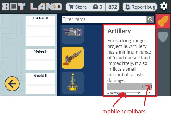
The solution was to not use a flexbox at all for the red box. I changed it to “display: block” and it worked just fine.
Elements aren’t aligned properly
Section titled “Elements aren’t aligned properly”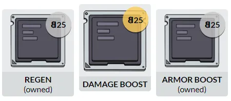
The container of the three elements is a “display: block”, and each gray container box is an inline-flex. I wanted to make an inventory that would show as many columns as would fit without resizing anything. I needed to switch to something like this for the outer container:
display: grid;
grid-template-columns: repeat(auto-fill, 150px);
